Airbnb
- Case Study -
Designing a new feature that allows users to schedule a safe and efficient ride from the airport to their Airbnb.
Project Overview
✧ Project Dates: August 2022 - November 2022 (80 Hours)
✧ Client: Airbnb
✧ Role: UX Researcher, UX Designer, User Testing
✧ Project Background: Airbnb is a worldwide online marketplace for users to book home-stays and experiences.
✧ Deliverables: A mobile feature that allows users to book a ride to to/from their accommodation.
✧ Tools: Figma
✧ Project Problem ✧
Airbnb doesn’t provide transportation to ensure users have a safe and easy way to their Airbnb location.
Empathize
Competitive Analysis
The first step was looking into existing transportation services that users currently resort to in their trip planning process.
1-on-1 Interviews
An interview with 4 participants was conducted to understand their travel experiences, including transportation while traveling.
Goals
Travel safely and efficiently
Remain in their budget
Motivations
100% of participants agreed that they would pay an extra fee to secure a safe ride to their accommodation
100% of participants have traveled for personal reasons and generally like to travel
Frustrations
75% of participants mentioned being overwhelmed by the amount of choices while traveling
The pressure of choosing the best option
Unnecessary travel expenses
Habits
100% of participants have personally made travel arrangements
Use apps to book travel
Define
User Persona
Following the research process, I compiled the common characteristics in order to make a persona.
Empathy Map
To better understand our potential users, I created an Empathy Map for Tiffany to understand her thoughts, feeling, and experience when traveling.
Feature Roadmap
Based off research, I created a list of features to be included in the design. I then gave each feature a priority level ranging from must have features to those that be implemented later in the design process.
Ideate
Task Flows
I created a task flow to map out each page a user would need in order to complete their task of booking a ride.
Low-Fidelity Wireframes
From the task flow, I created low fidelity wireframes of each page within the booking process.
Screen 1: Feature on Details Page, Screen 2-4: Select a Pickup Location, Screen 5-7: Select Pickup Time
Screen 8-9: Select Travelers, Screen 10: Ride Overview, Screen 11: Ride Confirmation, Screen 12: Updated Details Page
Design
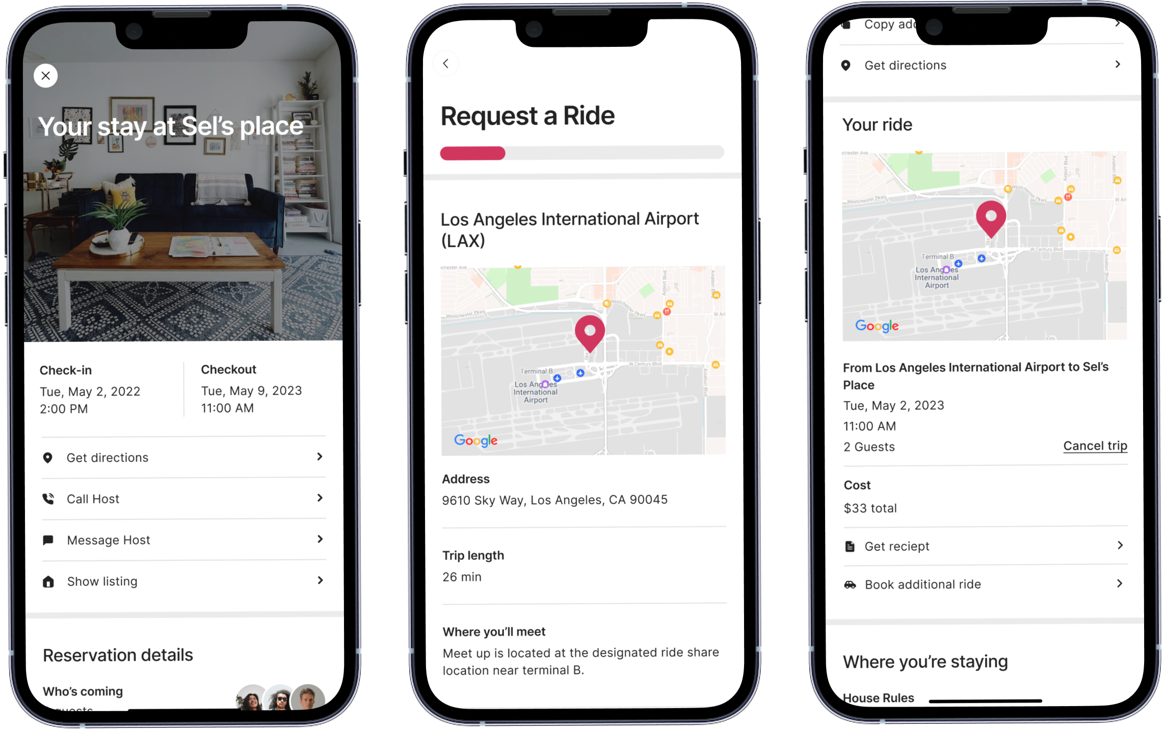
High-Fidelity Wireframes
The UI of Airbnb was added to the wireframes to create designs ready for prototype and testing.
Testing
Usability Testing
A prototype was then created to complete usability testing. The testing was completed in person with 5 users on a laptop due to prototyping constraints.
↖Prototype on Figma
Testing Scenario:
You recently booked an Airbnb in Los Angeles to visit some friends. You and a friend, who is also staying at your Airbnb, are flying into LAX on May 2, 2023 and will meet another friend at the airbnb. To easily get to your Airbnb, you decide to request a ride through Airbnb’s new shuttle service.
Task: Successfully book a ride to be picked up at 9:30 am.
Iterations
The results of the usability testing determined what worked for the feature and what needed more iterations.
Updated Flow
Users will now directly flow into typing in their pickup location. The blank “Select Location” page will only appear after user selects “clear all”.
Updated UI
Text were given lower opacity to make it more clear that the middle section is the selected time.
Prototype with iterations:
Reflection
If given more time the next steps taken in the project would be:
✧ Lower Priority Features
There was a comment during testing regarding the order of inputing information. I would like to conduct A/B testing to solidify the flow when requesting information and what works best for users.
✧ A/B Testing
Integrate the low priority features, such as the ability to track the shuttle along the ride.
✧ What I Learned ✧
Operating within the confines of Airbnb’s UI parameters presented both challenges and opportunities for me to showcase adaptability within a set framework. I discovered that the design elements of Airbnb seamlessly integrated with many of my own concepts and allowed me to deliver a harmonious addition to the app. However, given the fixed UI guidelines, I encountered challenges in adapting some aspects of my design. For instance, the time picker underwent multiple iterations before I arrived at a solution that blended cohesively with the style.

